Kia Ora and Welcome to my blog about…. Statistics!
This term we have been learning about Statistics and its importance when collecting data. We learnt about different types of graphs e.g
A Bar Graph, A Line Chart, A Pie Chart, A Stem and Leaf.
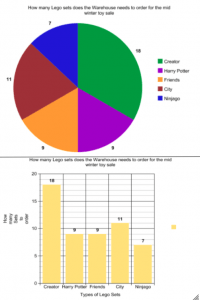
Today our thing was based on the Mid Winter Lego sale that happened at the warehouse yesterday. We had to give out recommendations to see which ones they should sell more and to do so we represented data in a chart. I did 2 graphs, A Pie Chart and a Bar Graph, here are my graphs.
Some statements on these charts:
I think that the Warehouse should sell more Creator Lego sets and less Ninjago sets.
I wonder why there are less Ninjago sets than any of the other sets.
I notice that Harry Potter sets and Friends sets are at the same amount of sets.
Anyways that’s my blog. Goodbye!
What is your favourite type of graph?